
Resources
ABOUT US / SERVICES / OUR CLIENTS / STORE / CONTACT
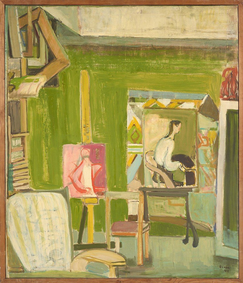
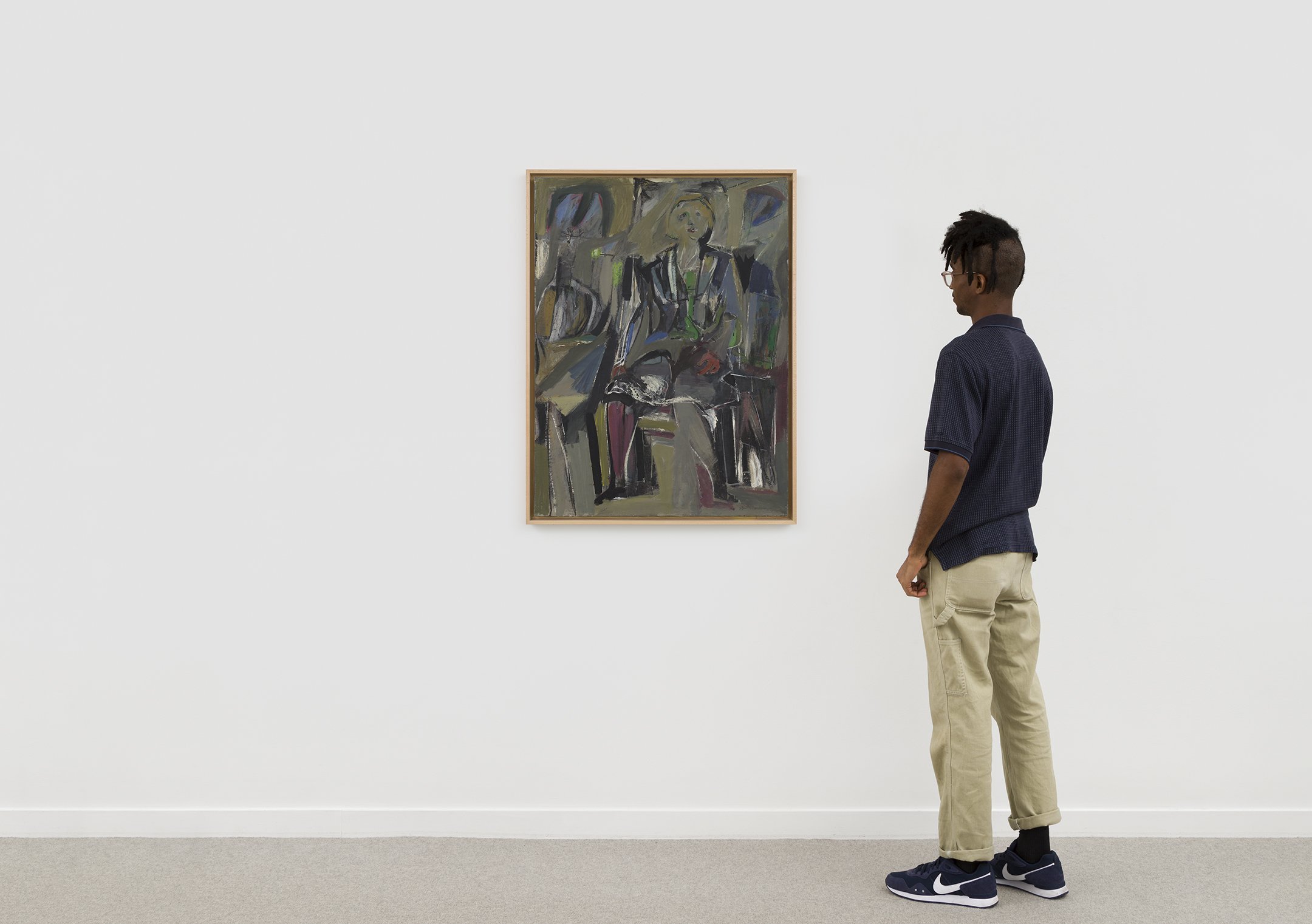
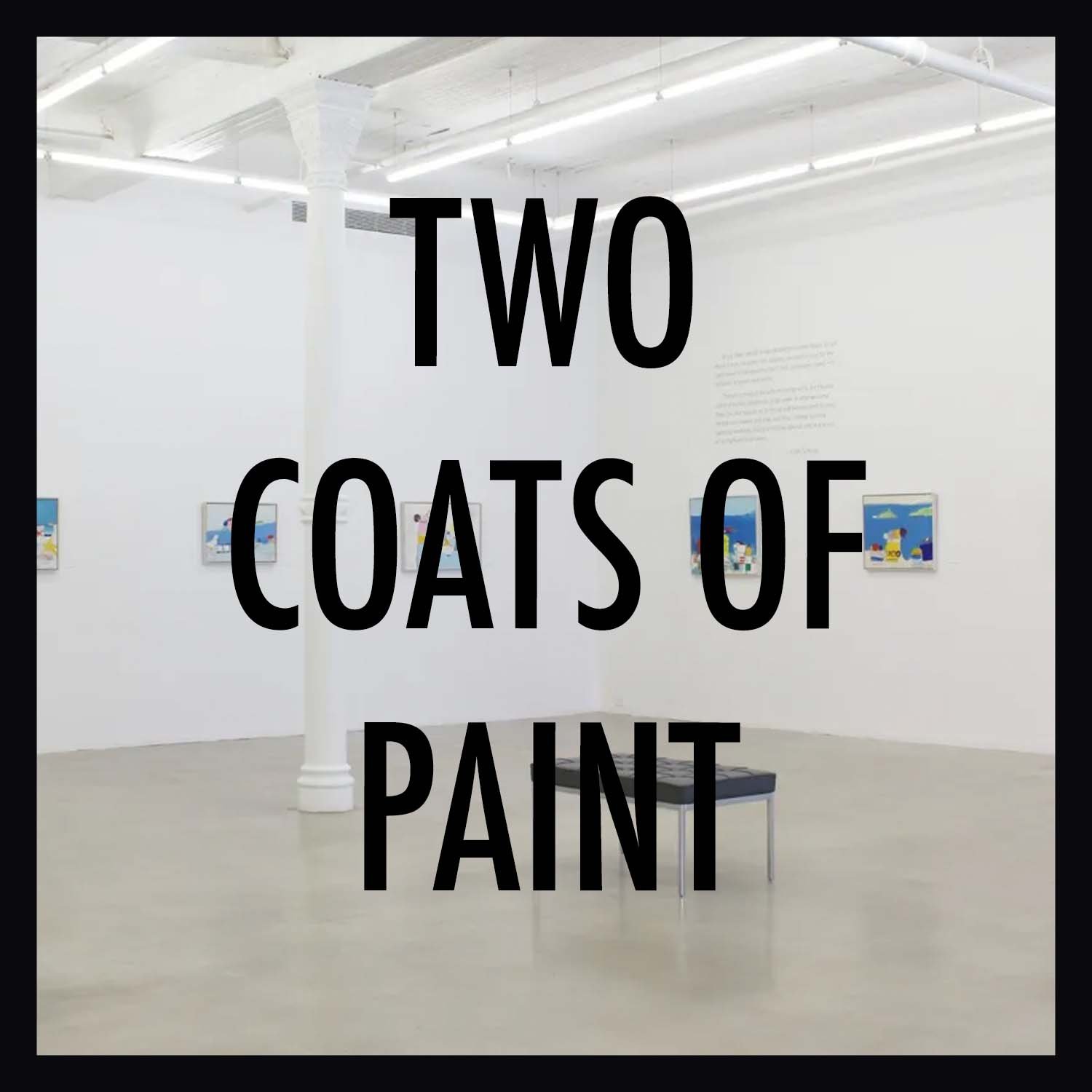
Review (via Two Coats of Paint): Janice Biala’s epochal studio

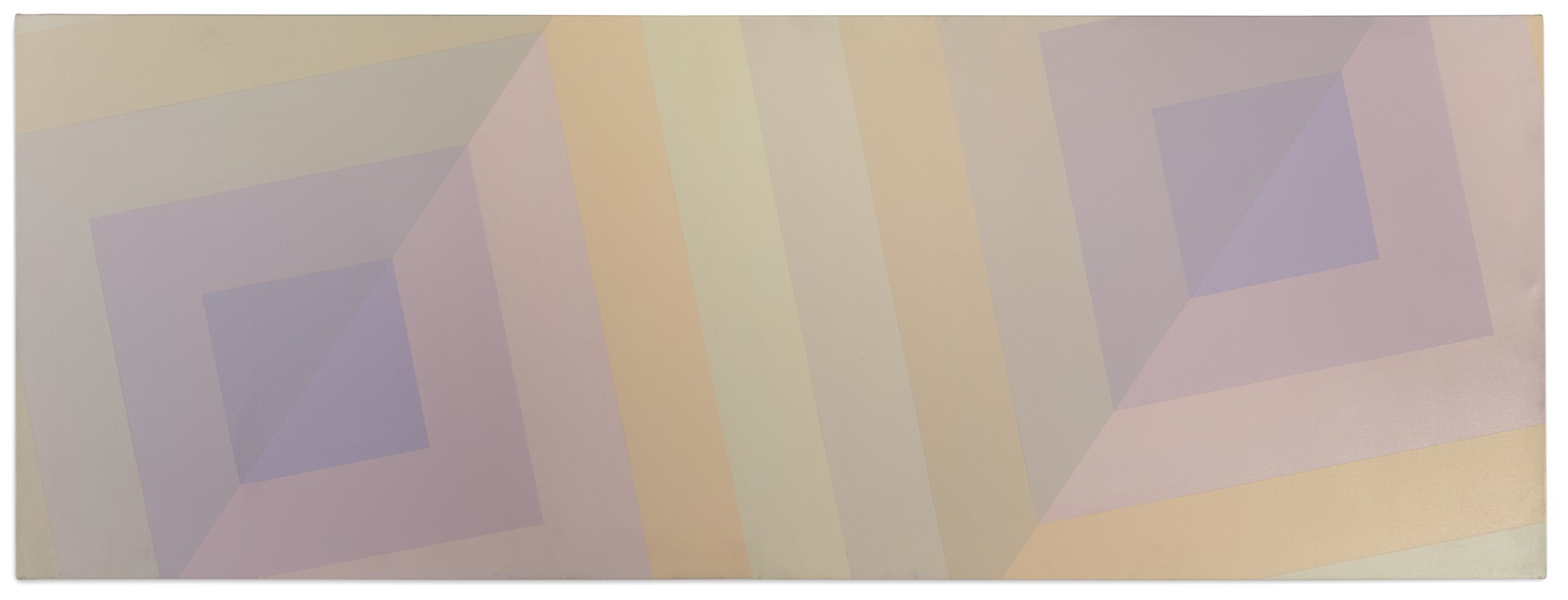
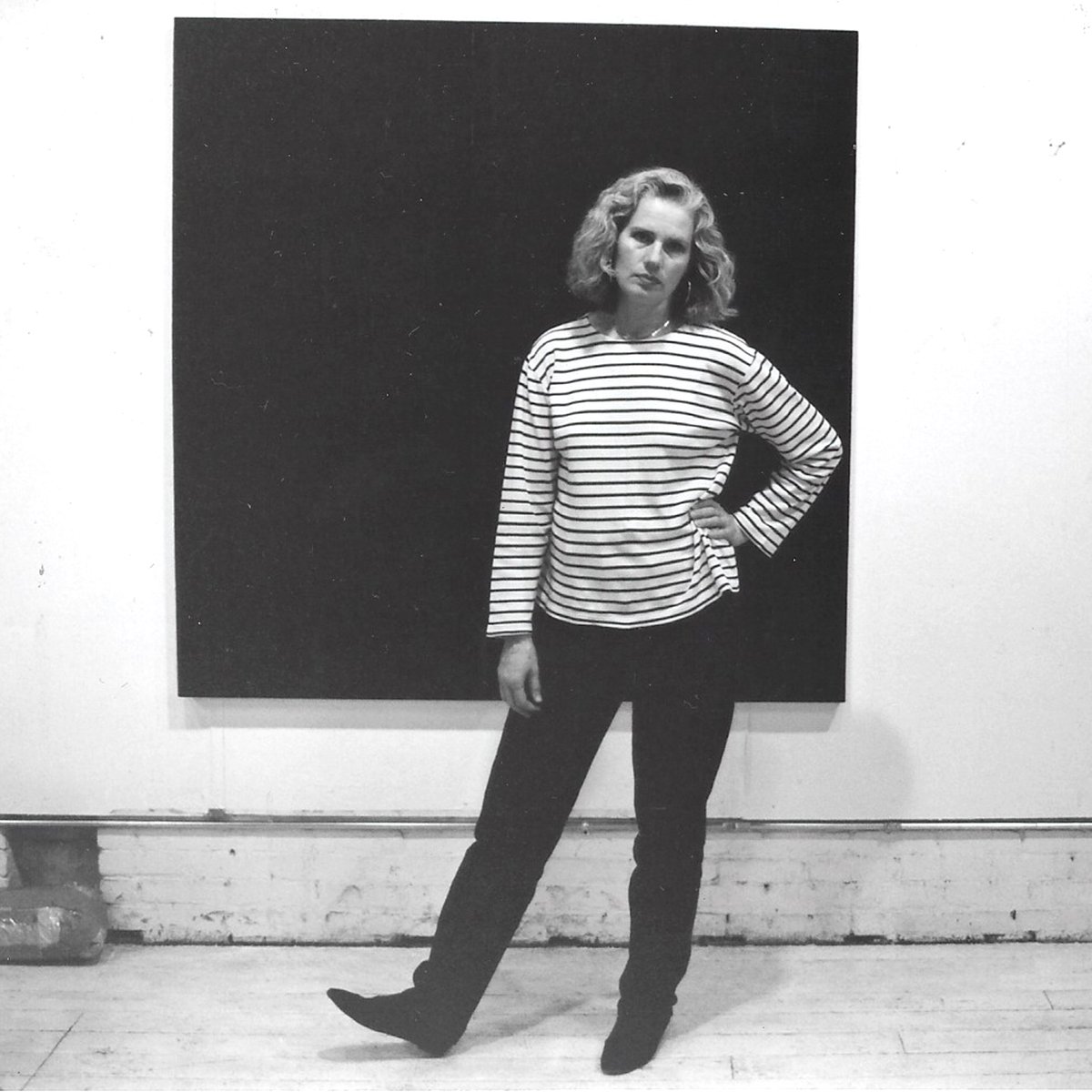
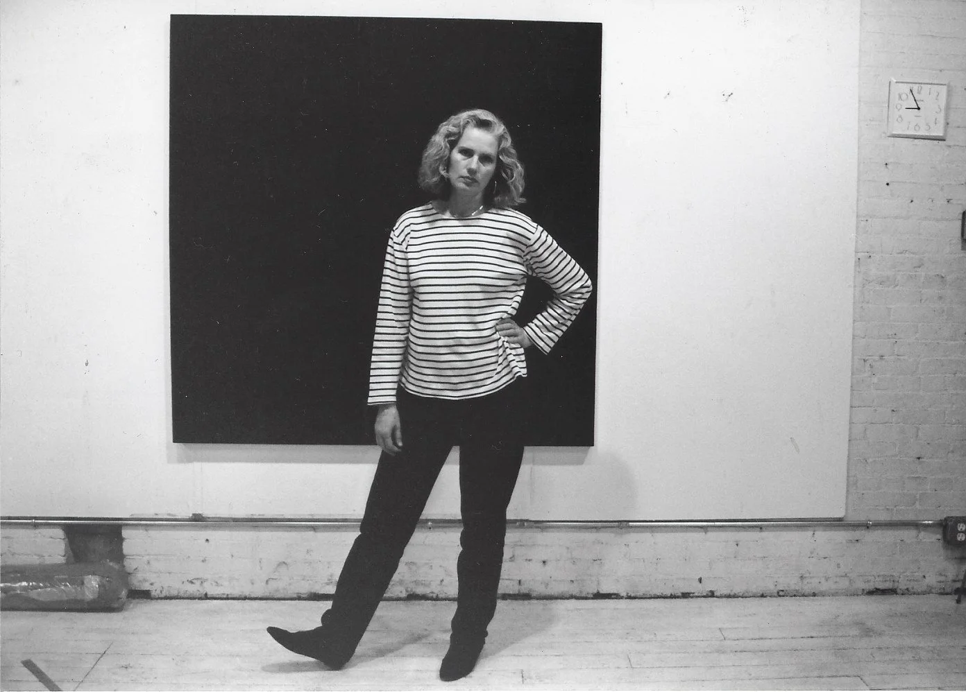
Janice Biala, The Studio, 1946, oil on canvas, 39 1/2 x 22 1/2 inches
by Jonathan Stevenson
A striking feature of the paintings and works on paper of Janice Biala (1903–2000), now on view at Berry Campbell in a show craftily curated by Jason Andrew, is their seamless reconciliation of civilizational clutter and spatial order. Fixing that notion is the earliest painting, The Studio (1946), arraying the artist’s active workspace and establishing her intent to embrace the world through it. (Coincidentally, Vera Iliatova’s “The Drawing Room” at Nathalie Karg gamely recaptures and updates kindred impulses.) Biala’s work here, spanning the immediate postwar period almost to the end of the Cold War and blending the New York School and the School of Paris – she lived in both cities – also bears the considerable weight of twentieth-century history, art and otherwise, with extraordinary grace and weightless cohesion, free of the strain of obvious contrivance.
Façade Blanche (White Facade), painted in 1948, depicts the physical strata of a Paris neighborhood with both due attention to detail and variegation and an implicit emphasis on the calmly agreeable organization of the visible environment, which is pointedly unoccupied. When Biala goes inside, as with Nature Morte à la Table (1948) and White Still Life (1951), she apprehends the material incidents of private life from a distinct remove, according them equal perspectival weight in cool tones that impart a sense of secure refuge within humanity’s sprawl and struggle. Even figures are absorbed into their inanimate surroundings. Jeune fille en rose, assise (Young girl in pink, sitting) is a moderate example, Two Young Girls (Hermine and Helen) a more extreme one verging on abstraction. The idea, it seems, is not the world’s erasure or engulfment but rather its harmonious accommodation of individuals, whatever their identities.
The trappings of Biala’s work are bohemian, not bourgeois, and it has a proletarian undercurrent. In Chevet de Notre Dame et l’ile St. Louis, 1949, the iconic church is iconoclastically painted from the rear, now a passive source of cultural comfort rather than an imposing summoning of faith or awe. Le Louvre (1948) is similarly down-to-earth, spied from the vantage of the Left Bank and settling humbly on the museum’s rooftop. Perhaps unsurprisingly, pieces from the mid to late 1950s, especially collages – see Violincelliste, Blue Parrot, and Untitled (Nature Morte) – are more abstract and suggestively gestural. Two drawings from the sixties – The Bather (Dana) and Study for “Blue Kitchen” – sunnily embrace the counterculture and 1960s modernism, respectively. Vaulting forward to the 1970s, the celebrated triptych Les Fleurs, isolating vases of flowers from separate perspectives, and Brown Interior with Rosine, presenting a woman sitting in drab comfort, assume a more austere, subdued, and regimented cast, perhaps a nod to the exigencies of age and the compulsion of preservation – or to fading glory.
Exhibition News: Biala at Berry Campbell (Mar 14-Apr 13)
Biala: Paintings, 1946-1986
March 14 - April 13, 2024
Opening reception: Thursday, March 14, 6-8pm
Berry Campbell
524 West 26th Street
New York, NY 10001
DOWNLOAD PRESS RELEASE
_________
NEW YORK, NY – Berry Campbell and the Estate of Janice Biala are pleased to announce a major survey of paintings by Janice Biala (1903-2000). The survey featuring over 20 paintings dating from 1946 to 1986, marks the largest gallery exhibition of Biala's work mounted in New York City with many works on view for the first time. A fully illustrated 100-page catalogue accompanies the exhibition which includes introduction by Mary Gabriel, author of “The Ninth Street Women,” and essay by Jason Andrew, manager and curator of the Estate of Janice Biala. This historic presentation coincides with the Grey Art Museum’s seminal exhibition “Americans in Paris, 1946-1962: Artists Working in Postwar France, 1946-1962,” opening March 2 in which Biala will be featured.
One of the most inventive artists of the 20th Century, and the painter most closely aligned with the continuation of a transatlantic Modernist dialogue between Paris and New York, Janice Biala (1903-2000), led a legendary life: a painter recognized for her distinctive style that combined the sublime assimilation of the School of Paris and the gestural virtuosity of the New York School of Abstract Expressionism.
Biala rose from humble yet tumultuous beginnings as a Jewish immigrant from Russian occupied Poland arriving in New York in 1913 settling among the tenements of the Lower East Side. She claimed the name of her birthplace for her own, going on to make personal and unique contributions to the rise of Modernism both in Paris and New York.
Having spent the decade of the 1930s as the last companion to the English novelist, Ford Madox Ford, Biala was the perfect representative of American bohemia in 1930s France and her journey as an artist evolved in tandem with the historic events of the 20th century.
Highlighting this survey is a pivotal group of paintings dating from 1947 to1952. On view for the first time in New York, these works were painted by Biala upon her triumphant return to Paris in 1947 aboard the de Grasse, one of the first passenger transatlantic ships to sail from New York to Europe after World War II. Her return was also a joyous one, “I still find in France all the things I’d hoped for,” she wrote her brother Jack Tworkov, “I’d have no use for Paradise if it wasn’t like France.” These works offer an extraordinary opportunity to see Biala’s close connection to European Modernists like Picasso and Matisse, both of whom she had frequently met.
Exhibition News: Moskowitz at Peter Freeman (Mar 14-May 16)
Robert Moskowitz: Paintings and Drawings from Four Decades
curated by Dieter Schwarz
14 March – 16 May 2024
Opening reception Thursday, 14 March, 6–8pm
Peter Freeman, Inc. is pleased to present Robert Moskowitz’s first solo exhibition with the gallery, curated by Dieter Schwarz, who writes: Robert Moskowitz has created an oeuvre that is painterly through and through, and at the same time possesses immense pictorial power. The selection of paintings and drawings in this exhibition makes it possible to trace some of Moskowitz’s motifs over an extended period of time.
In contrast to the imagery of Pop Art, Moskowitz’s images have a completely private character. Even the twin towers of the former World Trade Center, which he first painted in the late 1970s and revisited over the years, became a personal metaphor for him. Through his painterly treatment, Moskowitz reduces the image to its essential form and to its essential content, creating a particular physicality. This can be seen, for example, in the relationship between the image transformed into a silhouette to the color and format of the horizontally or vertically expanding picture surface. The image is embedded in it, waiting to be discovered by the viewer.
Moskowitz’s images possess a density and intensity that allows him to reproduce them in ever new forms over the years—be it on paper or on canvas. The subtle variations of medium—oil paint, pastel, graphite—and format express subtle variations of mood through the same image. In his studio, Moskowitz installed a large number of drawings, which mainly show iterations of the twin towers and the Flatiron Building. This wall of drawings, which is impressive due to the range of tonalities, has been reconstructed for the exhibition.
The room of paintings features a small selection of motifs: the Wrigley Building from Chicago, which Moskowitz painted from an advertising image, the Red Cross he glimpsed in a film with Bill Murray whom he admires, the Tsunami wave, and finally the man jumping into the depths from a mural in Pompeii. Moskowitz chose these images intuitively. In the course of his practice, which takes on obsessive traits through repetition and duration, both their physical presence and their enigmatic appearance become clearer. But the material beauty of the surfaces is only an attractive illusion because, as Moskowitz said in an interview, the images are existential: “what the picture is saying is not beautiful. It’s about being here.”

Review (via The SUN, NY): George McNeil, an Underappreciated Hometown Boy, Highlight a Healthy Gallery Season

George McNeil, “Demonic Disco” (1984)
by Mario Naves
via The Sun, NY
‘Estate of George McNeil: Discos and Dancers’
Picture Theory, 548 W. 28th St., Suite 238
Until May 11
Here’s a question that passed through my mind as I visited Picture Theory, a newish exhibition space at Chelsea: Would George McNeil (1908-95) have stooped to posting his paintings and prints on Instagram? I say “stooped” because of the animus McNeil had for self-promotion. This was the man who bowed out of Nina Leen’s renowned portrait of The New York School, “The Irascibles,” a photo that did much to cement its primacy in the public eye.
Think about it: The Mount Rushmore of Abstract Expressionism — Jackson Pollock, Willem de Kooning, Mark Rothko, and … George McNeil? There are myriad reasons an artist’s reputation does or doesn’t scale the heights. Personality is one of them; cultural cache is another. McNeil bristled when his individuality was put under duress: no team player, he. Still, McNeil’s peers held the work in high esteem — de Kooning was a fan — and scratched their collective head at his lack of notoriety.
McNeil’s art found an audience in the mid-1980s. His late canvases — rambunctious meldings of AbEx facture and graffiti-influenced pictograms — benefited from a renewed interest in both Expressionism and figurative painting. Given the buoyant and often uproarious nature of the compositions, not a few observers thought McNeil had finally achieved maturity at the ripe old age of 70-something. “As George McNeil gets older,” a former New York Times critic, Michael Brenson, wrote, “his work gets younger.”
“Discos and Dancers,” the current exhibition of McNeil’s art at Picture Theory, puts that theory to test. Among the most striking paintings in the show, “Occasion” (1966), predates McNeil’s popular heyday by a good two decades. Its melding of ArtBrut imagery with a Bonnard-like color palette may have been fobbed off at the time as not being sufficiently innovative. Yet McNeil was less interested in the outre than in the primal. He was painting for the long game. That, and the overriding subject of his work is joy. In the end, maybe McNeil wasn’t irascible enough.
McNeil’s pictures have not gone unnoticed by our cultural institutions. The work is included in the collections of MoMA, the Met, and the Whitney — where, for the most part, it has been gathering dust in the storage racks. You’d think our hometown institutions would want to celebrate a hometown boy, particularly given how much the paintings were inspired by our local music scene. Punks, disco dollies, and headbangers, oh my.
"Discos and Dancers" at Picture Theory, NYC (Mar 15-May 11)

Demonic Disco, 1984
Picture Theory presents “Discos and Dancers” from the Estate of George McNeil
March 15–May 11, 2024
Opening Reception March 14, 6–8PM
Picture Theory
548 W 28th Street, Suite 238
New York, NY
“As George McNeil gets older, his work gets younger,” observed critic Michael Brenson upon seeing the 80-year-old artist’s latest work (1). Inspired by his love of movement in Balanchine and Afro-Cuban dance, the rise of MTV, and the beats of John Coltrane, the Supremes, and Tina Turner filling his studio, McNeil embarked on the most exuberant and youthful series of paintings of his career throughout the 1980s until his passing in 1995. For example, his “Disco Series,” begun in 1981, captures the raucous, rapturous energy of New York nightlife. Weightless, colorful figures float across boundless, groundless space. The push and pull of color finds analog in the oppositional tension of limbs askew, torsos off kilter, and heads inverted, evoking the transcendent euphoria of the dancefloor.
With titles like Demonic Disco, the series conjures the conspiratorial relationship between music and dance to possess all senses of the body. The dynamic, sinuous lines, acidic colors, and surging brushstrokes strive for what the artist called, “pictorial sensateness,” or sensation experienced in form. Yet in these paintings, an ambiguity and disquiet pulses beneath the manic exhilaration, fantasy, and sexuality. Disco is, after all, a solitary dance, in that bodies move alone without touching other bodies. In these crowded disco canvases, figures may overlap, but they never seem to actually touch. A self-described humanist, McNeil lends pathos to the mythological, sometimes tragic, often sensual, Dionysian tales of the New York night.
The 1980s saw the Abstract Expressionist painter fully reveal the figure that had been lurking beneath his vibrant and spontaneous impastoed abstractions in decades prior. Dancers, bathers, and other human forms began emerging from fields of color in the 1960s. By the 1980s, McNeil had introduced bold, colorful outlines to sharpen their distinction from their painterly surroundings. The figures also became less universal and more specific, referencing punk rockers, football players, or the urban types encountered on Park Place and 47th Street.
For McNeil, these later bodies of work did not mark a significant break from his early abstract compositions. In an interview, he mused that “it seems to me that my work has always had not a human figure image, but it always had a figural image. ...I’m not a figure painter at all. I’m an abstract painter where I hope that bringing in the figure brings in certain human or psychological connotations or associations, and I hope that deepens the meaning of the picture.”(2) Expressionism, above all else, is paramount.
McNeil enjoyed a late career renaissance as critics found affinities in these paintings with German Expressionism, COBRA, Jean Dubuffet’s art brut, and more contemporary developments in Neo-Expressionism and graffiti art. Yet, McNeil’s “figural images” exude a personal, empathetic, and passionate warmth unique to an artist dedicated to articulating the complexities of our inner and outer worlds. His forceful compositional choices, singular color palette, and virtuosic application of paint evidence an artist passionately driven by the endless pursuit of plastic expression.
- Kara Carmack, March 2024
For more information, please visit picturetheoryprojects.com
Review: Siri Berg's Kabbalah Paintings

Installation View: Siri Berg: The Kabbalah Paintings from the 1980s, David Richard Gallery, New York, 2023. Artwork Copyright © Siri Berg Estate. Courtesy David Richard Gallery. Photo: Yao Zu Lu.
Siri Berg (1921–2020) was born in Stockholm, Sweden. She immigrated from war-ravaged Europe to the United States at nineteen years old. Her intense interest in color was formalized by studying with Austrian born Zita Querido—a former student and colleague of Hans Hofmann—at the Riverdale Fine Arts Society in New York. Color was a life-long passion, enhanced by Berg’s strong interest in the works and ideas of Johannes Itten and Josef Albers: she in fact taught Color Theory at the Parsons School of Design for more than thirty years.
Not content with manufactured paint, Berg mixed her own pigments, rigorously testing color on paper as well as exploring the potential of differently prepared canvas surfaces. This formal precision was not an end in itself, as we see in Berg’s “Kabbalah Paintings.” Berg stated in October 1984, “I plan to continue my exploration of how abstract painting can illuminate the mystical content and value of the Kabbalah.” She articulates this project perfectly,
I became interested in the figurative presentation of the Ten Sefirot from The Kabbalistic treatise by Moses ben Jacob Cordovero (1522–1570) and was impressed by the simplicity of its form. What struck me was how a simple form could visually represent so complex and intellectually profound a subject matter […] Using color, value and design to express the ascending and descending order from the lowest to the highest - thus equating in visual language the lowest with the darkest and the lightest or the “light” with the lightest […] I was especially attracted to the configuration because in all my work I have used form, not as a design element but as a vehicle for the search for unending intellectual and creative expression. This has permitted me to probe, to stretch, to develop, to evolve without distraction and constraint.”
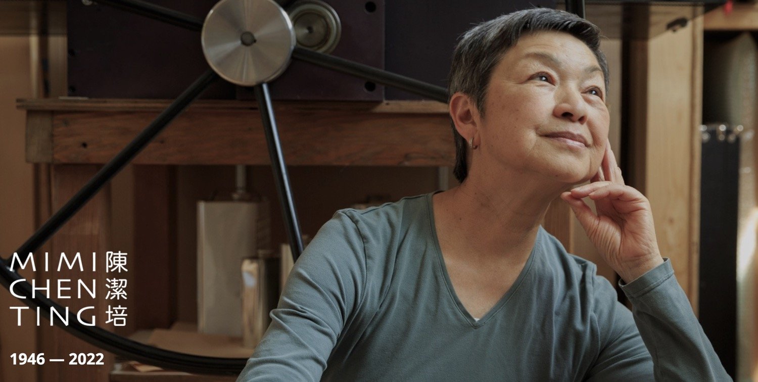
Mimi Chen Ting Major Survey Opens at University Art Gallery, Sonoma, CA

Mimi Chen Ting (1946-2022), Sleeping Woman, 1996, acrylic on canvas, 48 x 44 in (121.9 x 111.8 cm) © 2023 Estate of Mimi Chen Ting / Artists Rights Society (ARS), New York
This Side of Blue: The Art of Mimi Chen Ting
September 7-December 10, 2023
Opening reception: Thursday, September 7, 4-6pm
University Art Gallery at Sonoma State University
Art Building, SSU, 1801 E. Cotati Ave
Rohnert Park, CA
The University Art Gallery at Sonoma State University is pleased to present This Side of Blue: The Art of Mimi Chen Ting, which will be on view September 7 - December 10, 2023. Guest curated by Holly Shen, the exhibition is a watershed event: it is the most comprehensive survey of Mimi Chen Ting's five-decade career, it marks the first posthumous exhibition after her passing last year, and offers an in-depth assessment of Ting's extraordinary life and work. This exhibition is organized in collaboration with the Estate of Mimi Chen Ting and Artist Estate Studio, LLC, and supported in part by Louis Stern Fine Arts. A fully illustrated catalogue with essay by Holly Shen accompanies this exhibition.
General Information:
Press Contact: Jennifer Bethke, Director, bethke@sonoma.edu (707) 774-5624
Location: University Art Gallery, Art Building, SSU, 1801 E. Cotati Ave, Rohnert Park, CA
Hours: Tuesdays - Fridays 11:00-4:00 / Weekends 12:00-4:00
Admission: Free
Parking: $8 pass in any lot on campus
Telephone: (707) 664-2295
Website: http://artgallery.sonoma.edu/
Email: artgallery@sonoma.edu
Witek at The Armory Show (Sept 8-10)

Joan Witek (b.1943) “Edward Teller’s Dream [P(S)-12],” 1982, oil stick and graphite on canvas, 68 x 110 in (172.7 x 279.4 cm)
SECCI
The Armory Show
Booth 330
September 7-10, 2023
Javits Center
439 11th Avenue
New York City
SECCI will present historic works from the 1980s by Joan Witek. At the center of the installation is the nine-foot painting Edward Teller’s Dream (1982)—a painting inspired by an apocalyptic dream of Edward Teller (1908-2003), known as the “Father of the Hydrogen Bomb.”
During the early 1980s, Witek created seminal works that sought a kind of purity—a purity defined exclusively by her singular use of oil stick and graphite on unprimed canvas. Captured in Witek’s singularity is the play among surface, texture, proportion, and edge. Works from this period encapsulate the gesture and expansiveness of Abstract Expressionism into a measured calculated mark. While the look of her compositions may be representative of the cool “what you see is what you get” aesthetic of minimalism, Witek’s approach to abstraction is rooted in expressive narrative sources.
“I wished to reconcile abstraction and feeling,” Witek told John Caldwell, curator of her 1984 survey at the Carnegie Museum of Art, Pittsburgh.
“The irony of the work… is in appearing to be simple and easily grasped visually while an ongoing language of proportion and content proceeds through each work. Each painting depends on the others for interpretation. They are a handwriting. Although the writing style is relatively uniform, each picture has a uniquely based origin in my emotions or wherever a particular painting comes from. Its themes are the art of painting, or my perceptions of the world, or the renderings of my insides.”
Tworkov at Independent Art Fair (Sept 7-10)

Van Doren Waxter at Independent 20th Century
Booth E4
Sept 7 – 10, 2023
Cipriani South Street
10 South Street
New York City
Van Doren Waxter presents a selection of gallery artists at Independent 20th Century Art Fair (Sept 7-10). The booth will feature works by James Brooks, Richard Diebenkorn, Zoe Longfield, Milton Resnick, Hedda Sterne, and Jack Tworkov. Tworkov will be represented by a historic painting, an abstract portrait from 1949.
Siri Berg: Kabbalah Paintings @ David Richard Gallery, New York (Sept 5-Oct 5)

New York, NY–David Richard Gallery is pleased to present Siri Berg: The Kabbalah Paintings from the 1980s, on view from September 5 to October 5, 2023. The exhibition features paintings on canvas and paper mounted on stretched linen by the Swedish-American artist, renowned for her decades-long study of color and its meditative and transcendental nature. This is the first presentation of Berg’s work with the gallery and the first major survey of her work since her death in 2020.
The exhibition focuses on a perceptive series of works painted in the 1980s which intuitively address the Ten Sefirot of the Kabbalah—ten complimentary emanations through which the divine reveals itself in Jewish mystical tradition. Berg interprets these emanations by means of subtle color gradations arranged in concentric forms. Many of these works utilize texture and the way light dances and plays across her painted surfaces. These dynamic compositions, many of which are the largest created by the artist, offer dimensional tonal gradations of fleshy pinks, earthy yellows, and field drab greys—terrestrial allusions to the spiritually enlightened.
In these works, many of which have never been previously exhibited, one sees Berg’s repeated conceptual framework of evolving cause and effect from the Infinite to the Finite in systematizing the Kabbalah. This also includes permutations of binary formal properties including compositional formats such as horizontal versus square perimeters and single versus double concentric structures within a given composition; saturated versus de-saturated color palettes; flat versus highly textured painted surfaces; hard edged versus diffused borders of geometric forms; and mirror images of such binary properties both within a single structure and composition or across different compositions.
Berg was perennially inspired by the color studies of Johannes Itten (1888-1967) and Josef Albers (1888-1976), whereby her Kabbalah works built on their optical, scientific rigor with a metaphysical tenor. Reinterpreting this subject of Jewish mysticism, Siri used color, value, and design to express an ascending and descending order through value gradations from dark to light as a way to “resolve opposing aspects of life as they relate to abstract art.”
As her research into the Kabbalah began to explode, Berg wrote in October 1984: “I plan to continue my exploration of how abstract painting can illuminate the mystical content and value of the Kabbalah.”
“I became interested in the figurative presentation of the Ten Sefirot from The Kabbalistic treatise by Moses ben Jacob Cordovero (1522-1570) and was impressed by the simplicity of its form. What struck me was how a simple form could visually represent so complex and intellectually profound a subject matter [...] Using color, value and design to express the ascending and descending order from the lowest to the highest - thus equating in visual language the lowest with the darkest and the lightest or the “light” with the lightest [...] I was especially attract-ed to the configuration because in all my work I have used form, not as a design element but as a vehicle for the search for unending intellectual and creative expression. This has permitted me to probe, to stretch, to develop, to evolve without distraction and constraint.”
Opening reception: Thursday, September 14 from 6:00 to 8:00 PM
David Richard Gallery, LLC
526 West 26th Street, Suite 311 | New York, NY 10001
P: (212) 882-1705
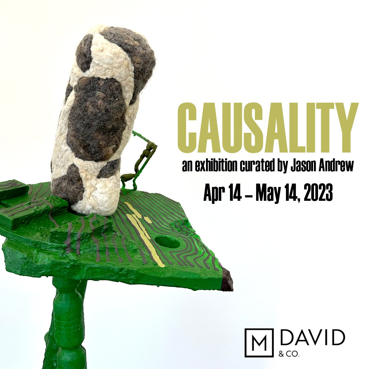
Jason Andrew curates "Causality" At M. David & Co. in Bushwick, BK

Causality: an exhibition curated by Jason Andrew
Opening Reception: April 14, 6-9pm
April 14 - May 14, 2023
56 Bogart Street, #114, Brooklyn
Directions: L Train to Brooklyn, Morgan Avenue stop.
Hours: Friday through Sunday, 1 - 6 PM or by appointment
––––––––––
Causality: when disparate elements are combined or random materials are stacked, when unlikely shapes are forged or incongruent designs are assembled, whether situationally mounted or unconventionally installed, this mishmashing, this mixed-amalgamation incites a new visual equilibrium. Our contemporary world is made up of this dynamism—an unceasing revel of cause and effect.
Featuring: Paula Barr, Sarah Bednarek, Ali Della Bitta, Daniel John Gadd, Brece Honeycutt, Ellen Letcher, Trevor King, Elizabeth Murray, Judy Pfaff, Wade Schaming, Christopher Vazquez, Greg Wall
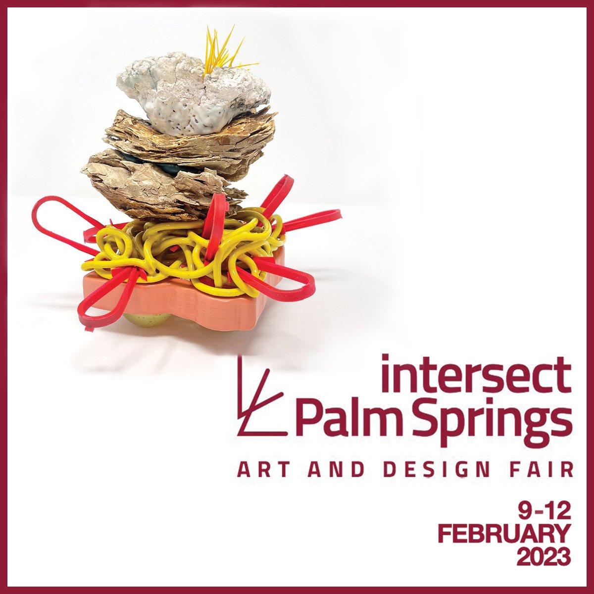
AES makes its art fair debut at Intersect Palm Springs!
Featured work: Ali Dell Bitta “landscaping memory: no. 007,” 2022, low fire clay, mid range stoneware, glaze, underglaze, rubber, plastic, and enamel paint.
Palm Springs Convention Center, Palm Springs
Booth #119
February 9-12, 2023
Click here to view a checklist of available works
––––––––––
Artist Estate Studio makes its art fair debut!
As an agency tasked to steward the legacy of artists, Artist Estate Studio brings an all-women presentation to Palm Springs.
This installment offers a multi-narrative rethinking of the art historical canon by exhibiting the work of five women artists including: the color-theories-made-personal in the works by Swedish-American painter Siri Berg (1921-2020); the lyrical paintings of Chinese-American painter Mimi Chen Ting (1946-2022); the bucolic abstractions of Judith Dolnick (b.1934); the fractured mosaic-like painted panels that capture ancient architecture by Hermine Ford (b.1939); the stark and strictly black and white oil-stick paintings by Joan Witek (b.1943); and the colorful tectonic mixed-media ceramics of Adirondack based sculptor Ali Della Bitta (b.1981). Grounding this selection are important prints by Joan Mitchell and Elizabeth Murray.
Of the artists presented, many have rarely, if ever, exhibited on the West Coast.
Dates and Times:
Opening Night Preview!
Thursday, February 9 | 5 - 8 pm (VIP/All Access Pass only)
General Admission:
Friday, February 10 | 11 am - 6 pm
Saturday, February 11 | 11 am - 5 pm
Sunday, February 12 | 11 am - 3 pm (10 - 11 am VIP hour)

Artist Estate Studio, Booth 119. Photo: RJ Sanchez

Siri Berg (1921-2020) “Kabbalah,” 1984-85, oil on canvas, 35 x 95 in (88.9 x 241.3 cm)
Siri Berg (1921-2020) was a native of Stockholm, Sweden. While attending the German Gymnasium and Victoria College in Prague she took life drawing classes at the Rotter-Schule für Werbegrafik. She then entered The Institute of Art and Architecture at the University of Brussels before immigrating to the United States at the age of 19. Siri worked briefly in interior design until she began pursuing her true passion—painting and color.
In the early 1980s, Siri Berg concentrated on the subject of the The Ten Sefirot of the Kabbalah—the attributes in Kabbalah through which The Infinite is revealed to create both the physical realm and the chain of higher metaphysical realms. Reinterpreting this subject of Jewish mysticism, Siri used color, value, and design to express an ascending and descending order through value gradations from dark to light as a way to “resolve opposing aspects of life as they relate to abstract art.”
Referencing the tradition of abstract geometric painting, specifically Johannes Itten (1888-1967) and Josef Albers (1888-1976), Berg’s work is noted for its purity. In her Kabbalah Series she explored, through progressions and variation, the systematic evolution of a theme.
Major monographic exhibitions include Swedish Embassy, Washington, DC (2019); The Bonniers Konsthall Museum, Stockholm (2018); Shirley Fiterman Art Center, New York (2016); The Painting Center, New York (2012); The William Whipple Art Museum at Southwest Minnesota State University, Marshall (2008); Gibson Gallery Museum at SUNY Potsdam (2006); Swedish American Museum, Chicago (2003); The Robert C. Williams American Museum, Atlanta (1997); The Yeshiva University Museum, New York (1991); The American Swedish Museum, Philadelphia (1986, 1999); Prominent public collections include The Solomon R. Guggenheim Museum, New York; Southwest Minnesota State University Art Museum MN; New York University, New York; Gray Art Gallery, NYU, New York; Moderna Museet (Museum of Modern Art), Stockholm, Sweden; The Swedish Ambassador’s Residence in Washington D.C. among others.

“Ten Spheres 22 (Kabbalah Series),” 1986, Monoprint, 18 x 31 in (45.7 x 78.7 cm)

“Ten Spheres 23E (Kabbalah Series),” 1986, Monoprint, 18 x 31 in (45.7 x 78.7 cm)
Ali Della Bitta (b. 1981), “landscaping memory: no. 007,” 2022, low fire clay, mid range stoneware, glaze, underglaze, and mixed media, H: 6.75 L: 3.5 x W: 4.5 in
Ali Della Bitta (b. 1981) is inspired by landscape ecosystems in flux and is specifically respondent to the increase of human impact on our natural spaces. This concern led to her research into endangered plants in the Alpine Region of the High Peaks in Northern New York State and inspired multiple excursions to our National Parks and exploring public lands across the United States. Della Bitta’s most recent landscaping memory series stems from these experiences. Primarily using the medium of clay, she layers various materials in the making of her sculpture.
The landscaping memory series focuses on the relationship to the environment: how we shape landscapes as a species and how it shapes us in return. Landscape ecosystems are constantly changing through disturbances that are anthropogenic or caused by natural processes. We are seeing the impact of these changes in our planet on a large and small scale. Just as landscapes may be altered and restructured so can our memories. Memories of smell, place, sound, a flash of emotion all layer and merge to create a life narrative. The malleability of human memory, the construction and the loss all hold a place in this body of sculpture.
Ali Della Bitta received her BFA from the University of North Carolina at Greensboro and MFA from Purchase College. She has held teaching positions at Purchase College, University of North Carolina, Greensboro, and is currently Associate Professor of Ceramics at State University of New York, Plattsburgh. Solo exhibitions include Art-St-Urban, Urban, Switzerland (2018, 2015); Plattsburgh State Art Museum, Plattsburgh (2017); Earlville Opera House, Earlville (2014); Collar Works, Troy (2013); among others. Group exhibitions include: “Lush,” Westobou Gallery, Augusta (2022); “Nächste Benefizveranstaltung, Art-St.-Urban, St. Urban, Switzerland (2018); Jay Invitational of Clay, Jay (2018, 2017, 2016); “Ways and Means: a new look at process and materials in art ,” 1285 Avenue of the Americas, New York (2016); Outlet Fine Art, Brooklyn (2015); among others. In September 2022, Della Bitta’s work was featured by Ceramics Monthly.

“landscaping memory: composition no. 002,” 2022, low fire clay, mid-range stoneware, pigmented high fire porcelain, glaze, underglaze, and epoxy, rope, rubber, and metal, H:7 L:6 W:5 in

“landscaping memory: no. 004,” 2022, low fire clay, mid range stoneware, glaze, underglaze, rubber, metal, and enamel paint, H:7 L:6 W:5 in

“landscaping memory: no. 006,” 2022, low fire clay, mid range stoneware, glaze, underglaze, metal, epoxy, rubber, enamel paint, H:6.75 L:7 W:7.25 in
Judith Dolnick (b.1931) “Perhaps to Dream,” 1998, acrylic on linen, 36 x 36 in (38.5 x 38.5 cm)
Judy Dolnick (b. 1934) has been working and exhibiting her lush abstract paintings since the late 1950s where, upon her return to Chicago with her art degree from Stanford, she, alongside artists Robert Natkin, Gerald van de Wiele, and Ann Mattingly opened the Wells Street Gallery, as a reaction to the lack of opportunities for emerging artists to exhibit the expressionistic paintings they were making at the time. With the struggling folk singer Odetta rehearsing upstairs, Dolnick and her crew created what critic Max Kozloff called "an avant-garde exhibition place filled with the most advanced abstractions in town.”
Dolnick moved to New York City in 1959 and began exhibiting alongside such seminal abstract artists as Willem de Kooning, Richard Diebenkorn and Franz Kline at the prestigious Poindexter Gallery. Critic Michael Brenson called her work the contemporary answer to “Matisse, Kandinsky and Dufy.”
Dolnick is most influenced by expressionism, and her works pay homage to Van Gogh (with whom she shares a birthday), Paul Gauguin, and Odilon Redon. Except for the slight pull of nostalgia, Dolnick's nonfigurative paintings are without a hint of gravity. Her seemingly endless expression of color is spontaneous and intuitive. In a mode of receptive reverie, Dolnick offers a surreal world dense with bucolic, ambiguous and semi-familiar shapes that suggest landscapes through scattered pulses of paint. Rhythm and gesture play a critical role in the process of Dolnick's work, a process she has continued to develop despite of her absence from the New York art world. This selection of paintings are like bright daydream fantasies.
Judith Dolnick received her BA from Stanford University (1955) and MFA from Illinois Institute of Technology, Chicago (1957). Solo exhibitions include Outlet Fine Art, Brooklyn (2015); Klonaridies Gallery, Toronto (1986, 1989); Gimpel & Weitzenhoffer, New York (1983, 1987); Hoshour Gallery, Albuquerque (1979); Poindexter Gallery, New York, NY (1976); Well Street Gallery, Chicago, IL (1957, 1958, 1959). Recent group exhibitions include “Judith Dolnick, Hermine Ford, Libby Hartle, Joan Witek,” Salon Zürcher, New York (2018); “Side by Side: Robert Natkin and Judith Dolnick,” Edward Hopper House Museum, Nyack (2016); “Arshile Gorky and a selection of contemporary drawings,” Outlet Fine Art, Brooklyn (2014); “To be a Lady: forty-five women in the arts,” 1285 Avenue of the Americas Gallery, New York (2012); “The Wells Street Gallery Revisited,” Lesley Helley Workspace, New York (2012). Dolnick’s work can be found in the permanent collections of Hirshhorn Museum and Sculpture Garden, Washington, DC, The Mint Museum of Art, Mint, Charlotte, NC, The Palmer Museum of Art, Penn State University, PA, and The Spencer Museum of Art, University of Kansas, Lawrence, KS, among others.

Untitled (497C), c.1986, acrylic on canvas, 13.25 x 12 in (33.76 x 30.5)

Untitled (181), c.1986, acrylic on linen stretched over canvas, 12.5 x 17 in (31.7 x 43.2 cm)
Hermine Ford (b. 1939), Untitled (433), 2022, Oil and ink on Muslin on shaped panel, 62.5 x 45.5 x .75 in (158.8 x 115.6 x 2 cm)
Hermine Ford (b. 1939) has developed a distinct style honing her aesthetic since the early 1970s. By re-imagining the past through elements of architecture, earth, and memory, Ford enhances our contemporary experience in her meticulously composed painted shaped panels.
Channeling her Abstract Expressionist roots (her father was the painter Jack Tworkov), Ford begins working gesturally upon a cut out surface which she invents by merging shapes found in nature and those found culturally in artifacts such as relics, shards, and ancient ruins. She then focuses on the surface imploring designs and patterns excavated from a vast library of diverse idiosyncratic forms that include weavings, Roman tile works. Embracing a process of reclamation, Ford offers a kind of exploded or fractured geometry trying to be whole again. From this perspective, her work exists as precious quarries of our visual history.
“We make objects of all sizes—buildings, art. Then they get old, sometimes are torn down, even made to disappear, by water, wind, war, volcanoes, earthquakes, tornadoes, floods, or fire. Or they fall down from their own weight, or are pushed over, stepped on, shot at, blown up, smashed. Yet, the pure material remains. The materials are reused down through the ages. Architecture and painting and sculpture are made from these raw and recycled materials. An artist's eye and hand moves over the materials while at the beach, or visiting an Italian city, or in the studio, remembers them as they used to be and rearranges them: the broken buildings, the stones, the tiles, the pigments. In my work I'm re-imagining the past, making it present.”
– Hermine Ford
Hermine Ford studied at Yale School of Art and Architecture, New Haven (1960-61) and received her BA from Antioch College (1962). She was Instructor or Visiting Artists at the following: Parsons School of Design (1977-83); Maryland Institute College of Art (1981); Rhode Island School of Design (1983); School of Art Institute of Chicago (1984); New York Studio School (1992); American Academy in Rome (2002); to name a few. Commissions include Johns Hopkins Hospital, Baltimore (2011). In 2018 she was elected member, National Academy of Design, New York. Solo exhibitions include: Furnace-Art on Paper, Falls Village (2022), The New York Studio School, New York (2019), 57W57Arts, New York (2018), Outlet Fine Art, Brooklyn (2018). Group exhibitions have included “Mosaics” at James Barron Art, Kent (2023), “American Painting: The Eighties Revisited,” Cincinnati Museum of Art (2021), “Red Telephone,” at Fierman, New York (2019), “1970s: 9 Women and Abstraction,” at Zürcher Gallery, New York (2016) among others. Public collection include Arkansas Arts Center, Carnegie Museum of Art, Pittsburgh; Hood Museum at Dartmouth, Hanover; Katzen Arts Center, Washington, DC; Metropolitan Museum of Art, New York; Provincetown Art Association and Museum, Provincetown; RISD Museum, Providence; Weatherspoon Art Museum, Greensboro; The Whitney Museum of American Art, New York; Yale University Art Gallery, New Haven among others.

Untitled (456), 2021, Ink, gouache and pencil on paper, 11 ¾ x 8 ¼ in (29.8 x 21 cm), framed: 15 ½ x 12 ⅛ in (39.4 x 30.8 cm)

Untitled (455), 2021, Ink, gouache and pencil on paper, 11 ¾ x 8 ½ in (29.8 x 21.6 cm), framed: 15 ½ x 12 ⅛ in (39.4 x 30.8 cm)

Joan Mitchell (1925-1992) “Sunflower V: from the Sunflower Series,” 1992, lithograph in colors, 56 ½ x 41 in (144 x 104 cm). This work is number 3 from the edition of 34, on Rives BFK wove paper, with the blindstamp of the printer and publisher, Tyler Graphics, Ltd., Mount Kisco, New York, framed
This work is one of Joan Mitchell's most sought after lithographic series featuring the life cycle of the sunflower.
In 1969, Mitchell completed a major series of paintings titled “Sunflower” one of which is in the collection of the Metropolitan Museum of Art (1989.349) and another at Smithsonian American Art Museum (1980.137.81).
In 1972, Mitchell returned to printmaking creating etchings with Arte Adrian Maeght, Paris. She titled this series “Sunflower,” which became a favorite leitmotif, and which grew in Mitchell’s gardens at Vétheuil where she settled in 1968.
The Joan Mitchell Foundation makes this statement about the 1972 edition which can be applied to the edition she would complete with Tyler Graphics two decades later and of which this print belongs:
"Sunflower-like forms emerge and dissipate in a riotous, scratchy landscape of growth. The autumnal tones of the Sunflower series point to Mitchell’s identification with the feeling of the dying sunflower."
Mitchell considered sunflowers to be ‘like people’ — subjects to empathize with whose life cycles were played out with exuberance but brutal swiftness.
Elizabeth Murray (1940-2007) “Charlotte,” 1998, eight color lithograph on John Koller handmade paper, 12 3/4 x 15 3/4 in (32.4 x 40 cm)
Artist Estate Studio, LLC, has had the honor of managing the Estate of Elizabeth Murray since 2016. Offered here is "Charlotte" a print from 1998 originating from a series of artist prints published by Brooke Alexander for the benefit of the Poetry Project.
Sale of these editions will benefit The Elizabeth Murray Artist Residency.
The Elizabeth Murray Artist Residency (EMAR) program by Collar Works is designed to provide a diverse group of emerging and established artists an immersive, supportive, productive, and communal atmosphere for art-making and dialogue on a bucolic 77-acre farm in Washington County. The summer residency is offered for five weeks, with two and four-week residencies for individual artists and one-week residencies for families.
Mimi Chen Ting (1946-2022) “Been There and Back,” 2015, acrylic on canvas, 54 x 48 in (137.2 x 121.9 cm)
Mimi Chen Ting (1946-2022) was a Chinese-American painter, printmaker, and performance artist whose high-spirited practice fused Eastern and Western aesthetics. She was active in the artist communities of the Bay Area of San Francisco, CA, and Taos, NM. An intense, unpretentious woman with a soft voice and fierce spirit, Ms. Ting was born in Shanghai, China, at the end of the Second Sino-Japanese War and during the communist takeover of the mainland.
While her career is book-ended by an interest in the expressive possibilities of abstraction, Ms. Ting’s paintings from the 1980s, 90s and early aughts focused primarily on figurative work that explored notions of womanhood, immigration, and a somatic relationship between landscape and place. Embracing the processes of Abstract Expressionism as well as the Buddhist practice of the beginner’s mind, Ms. Ting regularly approached her canvases without any preconceived ideas, preferring to allow the direct application of paint and the subconscious gesture to dictate her compositions. She often worked thematically and in series.
Mimi Chen Ting received her BA and MA from Cal State San Jose (1969, 1976) and studied dance and performance with Anna Halprin, Sherwood Chen, and Hiroko Tamano. Solo exhibitions include the forthcoming retrospective at Sonoma State University, Sonoma (2023); Norte Maar, Brooklyn (2022); Art Beatus, Hong Kong (2018, 2011) Vedder Price, San Francisco (2018); The Harwood Museum of Art, Tao (2005); Taos Fine Art Gallery, Taos (1993); Stanford University Center for Integrated Studies, Palo Alto (1991); Oakland Museum Collectors Gallery, Oakland (1986); Cal State University, San Jose (1979); Lucien Labaudt Gallery, San Francisco (1970). Group Exhibitions include “Work by Women,” Harwood Museum of Art, Taos (2018); “Face to Face,” Corrales Bosque Gallery, Corrales (2005); “Landscape and Memory,” Sedona Art Center Gallery, Sedona (2002); “Different Voices,” Santa Barbara Women's Center, Santa Barbara (1992); “75th Anniversary Exhibition,” San Jose Museum of Art, San Jose (1987). Public collections include Harwood Museum, Taos, University of Phoenix, Phoenix, among others.

Mimi Chen Ting (1946-2022) “Loves Notes,” 2016, acrylic on canvas, 48 x 54 in (121.9 x 137.2 cm)
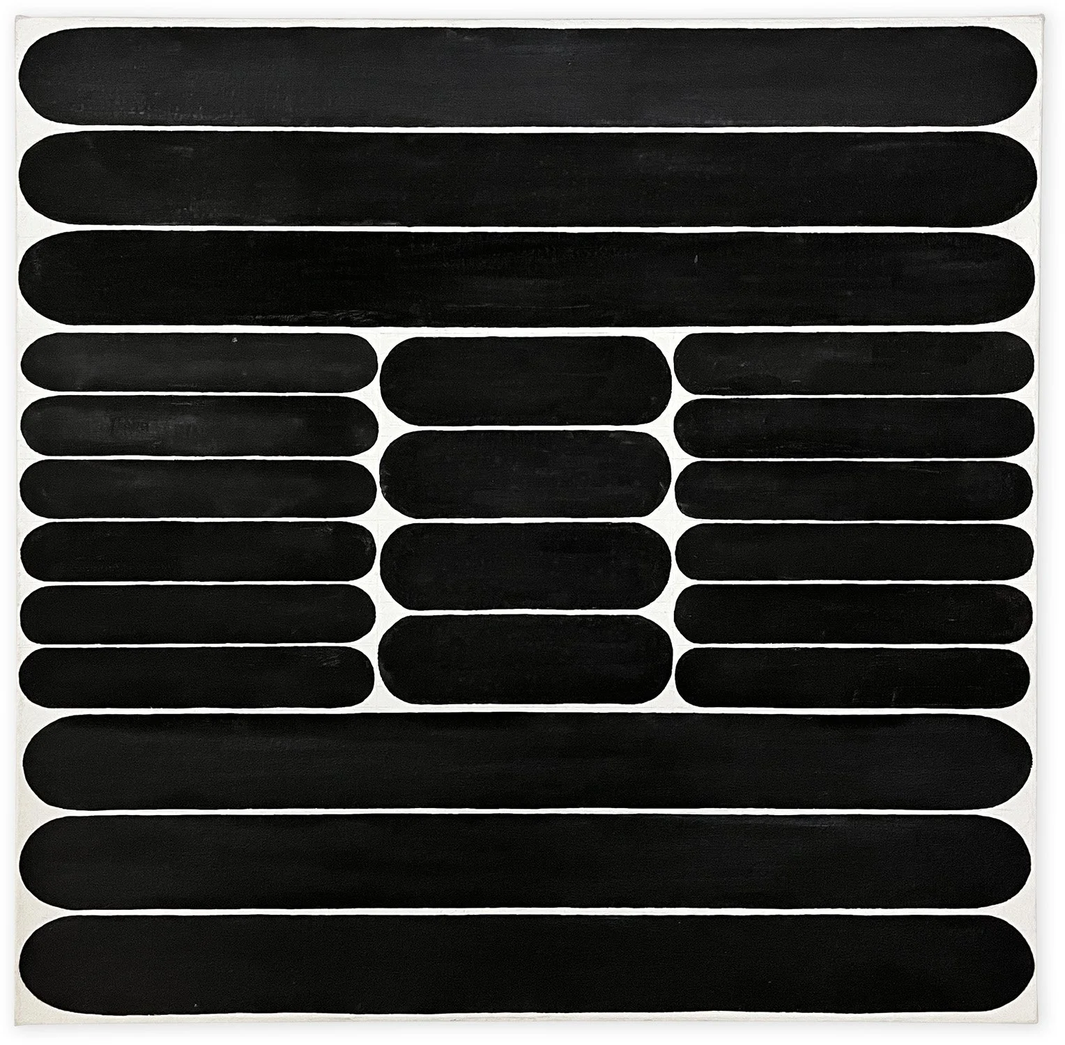
Joan Witek (b.1943) “P-162,” 2013, oil stick and graphite on canvas, 74 x 45 x 2 in (188 x 114.3 x 5 cm)
Joan Witek (b. 1943) has used the color black for much of her life as an artist. While appearing to be straightforward, there is a persistent language of proportion and meaning in her abstraction. “The breadth of this color from primitive to sophisticated, powerful to delicate, has left a wide area to explore,” she wrote, “The beauty of black still needs to be revealed, and I hope to continue to help that discovery along.”
In 1976, Witek set up a studio on Duane Street in Lower Manhattan where her next door neighbor was the sculptor, Richard Serra. There she began working in earnest and mostly in seclusion for some years.
During the early 1980s, she began developing composition based on the ‘mark’ of a single stroke. Her chosen medium then and now was oil stick which she applied onto the canvas nailed to her studio wall—the canvas being sized using rabbit skin glue. Blue snap lines delineated the space based on preparatory drawings. Uncomfortable with the stark contrast of the mark on raw canvas, Witek used graphite power to subdue the surface. Only after the composition was complete would the work be transferred to a stretcher.
Rising from the decades dominated by the likes of Ellsworth Kelly, Frank Stella, and Richard Serra, Witek, has adopted her own processes borrowed from a minimalistic language. By making the visual distinction between her compositional elements slight, through the course of her career Witek has produced works that deliberately avoid the formal and coloristic drama associated with much of Postwar American art.
Witek studied at the Art Students League during the 1960s. She received a BA from Hofstra University, Hempstead (1965). Major monographic exhibitions include “Joan Witek: a survey,” Museum Wilhelm Morgner, Soest, Germany (2021); “Joan Witek: Paintings from the 1980s,” Minus Space, Brooklyn (2022); “Joan Witek: Black to Black,” Gallery Niklas von Bartha, London (2002); “Joan Witek: Drawings,” Wynn Kramarsky, New York (1997); “Joan Witek: Paintings and Drawings 1970’s-1990’s,” Kendall Campus Art Gallery, Miami-Dade Community College, Miami (1993); “Joan Witek: Paintings 1980-1983, Drawings 1976-1984,” Museum of Art, Carnegie Institute, Pittsburgh (1984). Group exhibitions include Massey Klein Gallery, New York (2020); “Crossroads: Carnegie Museum of Art’s Collection, 1945 to Now,” Carnegie Museum of Art, Pittsburgh (2018); The Painting Center, New York (2016); "Between a Place and Candy: new works in pattern, repetition and motif," 1285 Avenue of the Americas Art Gallery, New York (2015); Jason McCoy Gallery, New York (2014); “Visible Places: Works on Paper by Women,” San Diego Museum of Art, San Diego (2008); Kouros Gallery, New York (2002, 2006)); “Planes of Color,” Greg Kucera Gallery, Seattle (1999); “Drawing Is Another Kind of Language,” Harvard University Museum, Cambridge (1997); "Paper Under Pressure," Ackland Art Museum, Chapel Hill (1994); “Slow Art: Painting in New York Now,” PS1, Long Island City (1992); John David Gallery, New York (1986, 1987); Rosa Esman Gallery (1984, 1985); “Women Artists from New York,” (curated by Lawrence Alloway) Art Gallery, Fine Arts Building, SUNY at Stony Brook (1978). Public collection include Albright-Knox Art Gallery, Buffalo, The Baltimore Museum of Art, Baltimore, Colby College Museum of Art, Waterville, Metropolitan Museum of Art, New York, Museum of Art, Carnegie Institute, Pittsburgh, Pennsylvania Academy of the Fine Arts, Philadelphia, Smith College Museum of Art, Northampton, University Art Museum, UCLA, Santa Barbara, and Yale University Art Gallery, New Haven, among others.

“P-149,” 2009, oil on canvas, 24 x 24 in (61 x 61 cm)
“P-156,” 2011, oil on canvas, 24 x 24 in (61 x 61 cm)
Baltimore Museum of Art Acquires Major Painting by Joan Witek
Joan Witek in her Duane Street Studio, 1997. Photo: V. Crespo. Courtesy Studio of Joan Witek and Artist Estate Studio LLC, Brooklyn
The Studio of Joan Witek and Artist Estate Studio LLC are pleased to announce that Joan Witek’s painting Introductory Glyph (1982) has been acquired by The Baltimore Museum of Art. This major purchase marks the first work by the artist to enter the collection.
Event (Sept 14): The Shape of Freedom, Biala and Sterne: a virtual walk-thru and talk
The Shape of Freedom: a virtual walk-through with curator Daniel Zamani and conversation regarding the life and work of Janice Biala and Hedda Sterne hosted by Artist Estate Studio, LLC.
SPEAKERS:
Daniel Zamani, Curator, Museum Barberini, Potsdam, Germany
Jason Andrew, Curator/Manager of the Estate of Janice Biala
Ekaterina Klim, Director of the ASOM collection
The Shape of Freedom: International Abstraction after 1945 is currently on view at the Museum Barberini through September 25. The exhibition examines the creative interplay between Abstract Expressionism and Art Informel in transatlantic exchange and dialogue, from the mid-1940s to the end of the Cold War. The exhibition includes more than ninety works by around fifty artists, amongst them Sam Francis, Helen Frankenthaler, K. O. Götz, Lee Krasner, Georges Mathieu, Joan Mitchell, Ernst Wilhelm Nay, Barnett Newman, Jackson Pollock, Judit Reigl, Mark Rothko, and Clyfford Still. The over thirty international lenders include the Centre Pompidou in Paris, the Tate in London, the Museo nacional Thyssen-Bornemisza in Madrid, the Whitney Museum of American Art and the Metropolitan Museum of Art in New York, the National Gallery of Art in Washington, the Museum Frieder Burda in Baden-Baden, and the Peggy Guggenheim Collection in Venice. The exhibition is organized by the Museum Barberini, Potsdam, the Albertina Modern, Vienna, and the Munchmuseet, Oslo, curated by Daniel Zamani. With generous support from the Fondation Gandur pour l’Art, Genève.
Review: Edith Schloss: Blue Italian Skies Above
What a wonderful time to discover the sly and seductive charm of Edith Schloss's largely under-the-radar art, writing, and life.

Installation view, Edith Schloss: Blue Italian Skies Above, at Alexandre Gallery, April 30 - June 11.
What a wonderful time to discover the sly and seductive charm of Edith Schloss’s largely under-the-radar art, writing, and life. All of it is so apt, entertaining, and informative that it’s impossible to decide what should be quoted for insight or fun. For example, the novelist Jane Bowles sets the stage, speaking from the Chelsea loft on 21st Street that Schloss shared with her husband of 13 years photographer Rudy Burkhardt:
I know that everyone here has slept at one time or another with someone or another in this loft. We stared at one another, old lovers new husbands, this one having lived with that, secretly or not, summer or winter, in rain or shine—Bill Elaine, Edwin, Fairfield, Anne and Anne, Jean, Ruth, Pit, Larry, Milton, Alex, tess, Walter, Paul, Fritz, Nell, Ilse, Marisol, Bob, Jimmy, Jane, Joe, Rudy, and me. It was uncanny. It was true. Everyone was there.
The German-born artist, who died in 2011, documented off-handedly her life as a refuge first in New York, in 1942, and then Rome in 1962, in an insightful posthumous memoir Loft Generation: from de Kooning to Twombly Portraits and Sketches 1942–2011.
Schloss also left us with an ebullient body of warm and eccentric paintings created in the 1960s and ’70s on the island of Spezia that were recently on view at Alexandre Gallery’s new fresh-white downtown space. In these, the objects are the characters sharply profiled—the little boats, beach balls, a lone bird, a bowl of fruit, close ups of primary-colored lollypop-like flowers pose head on. The painting Spring Green (1967) poignantly features two Gustonesque figures as objects, one with baby, stretched out flat on the grass.

News: WHITEHOT MAGAZINE Interview with Hermine Ford
As the daughter of first-generation Abstract Expressionist Jack Tworkov, Hermine Ford grew up immersed in the counterculture of Abstract Expression and spent her childhood surrounded by her father’s inner circle of influential American painters including William de Kooning and Robert Rauschenberg. With such a significant upbringing, Ford was almost fated to be a painter, despite a natural desire to set herself apart from the strong male figures in her life.

Hermine Ford, Untitled, 2021, 2021. Oil paint, graphite, colored pencil on muslin on shaped wood panel, 38.50h x 51w in. Courtesy of the artist and Furnace.
HERMINE FORD: NORMALLY INVISIBLE
FURNACE - ART ON PAPER ARCHIVE
THROUGH JUNE 12, 2022
By WM, June 2022
As the daughter of first-generation Abstract Expressionist Jack Tworkov, Hermine Ford grew up immersed in the counterculture of Abstract Expression and spent her childhood surrounded by her father’s inner circle of influential American painters including William de Kooning and Robert Rauschenberg. With such a significant upbringing, Ford was almost fated to be a painter, despite a natural desire to set herself apart from the strong male figures in her life.
Eventually and courageously, she gave into destiny and began a longstanding career as an artist in her own right, developing a singular style of painting that examines materiality of the natural and built environment through colorful perforated patterns that combine formal abstraction with technical drafting.
A current solo exhibition of her work, Normally Invisible, on view at Furnace - Art on Paper Archive in Falls Village, CT, presents an intimate selection of works on paper and shaped canvases that highlight the meticulous process and complex concepts behind her well-regarded works.
Normally Invisible will be on view until June 12, 2022.
WM: You have had an impressive, long-standing career as a painter. When did you first begin creating and how did you know you wanted to be an artist?
HERMINE FORD: I was a child who loved to paint and make things. In high school, it was considered foreordained that I would be an artist. But I grew up in a family of artists and had married one, and I tried very hard to become other things. Finally, I gave in and decided I would summon the courage to make my own way as a painter.
What were your early works like? How has your work evolved over the years?
I began drawing from the model at an early age. My first serious works as a young adult were closely observed drawings made in the dunes behind Provincetown. These soon became very abstract and quite minimal in some ways. The first works after the dune drawings and for quite a few years, were long, horizontal paintings divided into equal sections. Reading from left to right with one section still referring to the dune drawings, next a blow-up of a few drawing strokes, next an eccentric shape lifted out of the field of marks, then square flatly painted an artificial green, a green as different from the color of grass as possible, a commercial color associated with building trim. I was asking what is natural? What, if anything, is truly artificial? The scale, the over-all shape, the palette, the references, have expanded over the years. But the combining of observable natural forms with pattern-making by the earliest people, itself lifted from nature, plus what scientists can tell us through maps and diagrams, give me a heady way of embracing it all.
Your work reads as well-thought-out and carefully executed. What does your creative process look like from start to finish?
I make lots of small drawings. When I’m ready I make a large pattern on butcher paper of the full size piece I want to make. I prepare the support, I trace the pattern onto it, cut it out from the board with a jig-saw. I very spontaneously lay very thin washes of paint all over the surface. I’ve given some thought to the color but otherwise I don’t control or judge it very much. When I begin the painting, the over-all shape is set, and I usually have an idea for the main color feeling, but once I start it’s all quite free and intuitive. As I paint, the variegated ground color beneath each stroke changes the effect so the over all color is a continual surprise. I never change the physical shape of the painting, but I build the color, and the texture of the paint within these constraints quite freely. I sometimes make significant changes in the color before I’m done.
Review: Edith Schloss's Deep Cheer
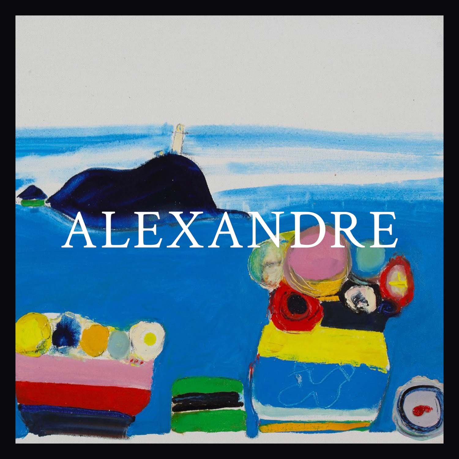
As the title “Blue Italian Skies Above” suggests, walking into the exhibition of Edith Schloss’s paintings now at Alexandre Gallery produces a kind of pastoral contentment. But don’t be fooled into thinking she was a shallow, acquiescent Pollyanna. Lurking in that casual lightness is a distinct quality of mortality and limitation.

Edith Schloss, Blue Italian Skies Above, 1968, oil on canvas, 11 3/4 x 31 1/2 inches
Contributed by Jonathan Stevenson
As the title “Blue Italian Skies Above” suggests, walking into the exhibition of Edith Schloss’s paintings now at Alexandre Gallery produces a kind of pastoral contentment. Many of the paintings depict a swatch of Italian beach to which she decamped from Rome – her primary home from 1962, when she left New York, until her death in 2011. A tranquil blue seems dominant in her palette, and the phenomena she presents in her calculatedly primitive pastiches – flowers, butterflies, tablecloths, tchotchkes, the sun, the moon, occasionally what looks phallic – can all be associated with good vibes of one kind or another. Don’t be fooled into thinking she was a shallow, acquiescent Pollyanna, though. Lurking in that casual lightness is a distinct quality of mortality and limitation.
The sense of that quality is not tragic but rather stoic – maybe wistful but resolutely short of sentimental. As she reveals in her posthumously published memoir The Loft Generation, she was far from clueless. She decried the diminution of women in the “what the fuck man’s land” of the New York art scene in the 1950s, and later the difficulty of being taken seriously as an artist while earning a living as an art writer and critic. When her work comes under closer scrutiny, the blue cheer of the 20 paintings yields to mood shifts, conveyed by changing seasons, weather, or time of day, rendered with elegant simplicity, and echoed in Schloss’s titles.
“Edith Schloss: Blue Italian Skies Above,” Alexandre Gallery, 291 Grand Street, LES, New York, NY. Through June 4, 2022.
News: Estate of Edith Schloss now Represented by Alexandre Gallery
Alexandre Gallery is pleased to announce the exhibition Edith Schloss: Blue Italian Skies Above, the gallery’s inaugural exhibition of works by the artist (1919-2011), marking its representation of the estate.

Alexandre Gallery is pleased to announce the exhibition Edith Schloss: Blue Italian Skies Above, the gallery’s inaugural exhibition of works by the artist (1919-2011), marking its representation of the estate. Examining Schloss’s work from the 1960s and 70s, this exhibition presents a collection of never-before-seen works, many of which were produced during the artist’s summers overlooking the bay of La Spezia, Italy. Edith Schloss: Blue Italian Skies Above, Paintings from the 1960s and 70s will be on view from April 30-June 4 and will be accompanied by a catalogue with new scholarship by Jason Andrew. Public reception will be Saturday, April 30 3-5p.
Bold and at times brash, Schloss ingested the style and mentality of the Abstract Expressionists among which she was intrinsically linked. Her work spans painting, assemblage, collage, watercolor, and drawing and embraces the intimate, the primitive, and the profound. Guided by a delight in pure color and childlike curiosity, her playful imaginings of still lifes, laid over vibrant renderings of views out of open windows onto the Mediterranean sea, are a joyful celebration of common wonders. These works, manifest her new-found acquaintance with Giorgio Morandi, feature tchotchkes collected and arranged, animating the symbolism of each item: “I look at them and the weather before me,” she said, “and try to have clear ideas about it all and the world, and to put it down in the simplest color and line […] Abstract art? Figurative art? All art is a fusion of the real outside, and that which is inside us.”
Born in Germany, Schloss immigrated to New York City via London in 1942, where she became an observant member of the abstract expressionist movement and part of the thriving community of artists and intellectuals that found camaraderie in the neglected lofts of downtown. These included artists Elaine and Willem de Kooning, Jack Tworkov, Larry Rivers, composer John Cage, and poets John Asberry, Frank O’Hara, and James Schuyler. She was among a minority of women artists in the New York School of the 1950s and 60s, and was featured in the historic 1961 exhibition, The Art of Assemblage, at the Museum of Modern Art, New York. In 1946, she married photographer Rudy Burckhardt and had a son Jacob Burckhardt. When the couple separated, Schloss “fled” New York for Rome. Expecting to stay on only a few months, she remained there a lifetime befriending Cy Twombly and mentoring Francesca Woodman. As a renegade expat, became a noted transatlantic correspondent of art criticism and continued to write and paint until she died in 2011 at the age of 92.
In 2021, Schloss’s long-awaited, captivating posthumous memoir, The Loft Generation: From the de Koonings to Twombly; Portraits and Sketches, 1942–2011, was published by Farrar, Straus and Giroux and included in New York Times’ Top Books of 2021. The book received numerous favorable reviews: Alexandra Jacobs of The New York Times called it “A glowing jewel of a book,” Jed Perl for the New York Review of Books championed it for capturing “the heat of those times,” and Jamie Hood for Vulture wrote, “Schloss extends the reach of the ghostly archives of an artist, a scene, a moment.”
“I am pleased to celebrate the announcement of this representation and exhibition. Alexandre Gallery has long advocated for the likes of Arthur Dove, Marsden Hartley, and Helen Torr. Edith’s life and work will now be aligned with these legacies and recognized as essential in the course of American Modernism.” —Jacob Burckhardt, Estate of Edith Schloss

Edith Schloss, “Spring Green,” 1967, Oil on canvas, 27 3/4 x 23 3/4 in (70.5 x 60.3 cm)
Edith Schloss was born in 1919 in Offenbach, Germany, and immigrated to New York City during World War II. In 1962 she moved to Italy, where she lived and worked until she died in 2011.
She studied at Shrewsbury Technical College, Shropshire, UK (1940), Boston School of Practical Arts, Boston, MA (1941), Art Students League, New York (with Harry Sternberg, Will Barnet and Morris Kantor) (1942-46), and the New School of Social Research, New York (1948).
Schloss actively exhibited at galleries throughout her lifetime, including Ashby Gallery, New York (1947), Workshop Gallery, New York (1959), Tanager Gallery, New York (1960), Galleria Aleph, Rome (1964), Galleria Il Segno, Rome (1968, 1974), Green Mountain Gallery, New York (1970, 1972, 1974), Ingber Gallery, New York (1974, 1975, 1977, 1979, 1981, 1983, 1985, 1987, 1989), Galleria II Gabbiano, La Spezia (1983, 1986), Galleria Giulia Arte Contemporanea, Rome (2008, 2009). In 2015, the first posthumous retrospective in New York was mounted at Sundaram Tagore Gallery, curated by Jason Andrew. Selected works from the artist’s Rignalla Series were exhibited at the Meredith Ward Fine Art in 2018.
Select institutional survey exhibitions include Klingspor-Museum, Offenbach, Germany (1990), The Keats-Shelley House, Rome (1993), Il Museo del Louvre, Rome (1997), St. Stephen’s School, Rome (2000), and Centro Arte Moderna e Contemporanea della Spezia (CAMEC) (2013).
Schloss’s work can be found in prominent private collections in New York, London, Paris, Berlin, Frankfurt, Tokyo, Sydney, Rome, Milan, Ferrara and La Spezia. Her work is represented in the public collections of The Metropolitan Museum of Art, New York; the Keats-Shelley House, Rome; the Hessisches Landesmuseum, Wiesbaden; and the Offenbacher Stadtmuseum, Offenbach, Germany, to name a few. Her work has been reviewed by The New York Times, Art in America, Art News, Flash Art, Hyperallergic, among others.

Obituary: Mimi Chen Ting (1946-2022)
Mimi Chen Ting (1946-2022), a Chinese-American painter, printmaker, and performance artist whose high-spirited practice fused Eastern and Western aesthetics, has died on March 6. The cause was complications due to a long battle with cancer.
She was 75 and was active in the artist communities of the Bay Area of San Francisco, CA, and Taos, NM.
An intense, unpretentious woman with a soft voice and fierce spirit, Ms. Ting was born in Shanghai, China, at the end of the Second Sino-Japanese War and during the communist takeover of the mainland. As a teenager her father swept floors for the industrialists Song Brothers to support his own family. By the time of Ms. Ting’s birth, he had worked his way up to Bank manager. Her mother was a concubine introduced to her father—16 years her senior when she was just 13. Raised in what Ms. Ting considered feudalistic China, she grew up in a compound with a shared courtyard where she played with other children and waited for the rice popper man to pass by. Memories of her maternal grandmother’s bound feet made a lasting impression–the imagery of which entered into many of her early figurative paintings.
As Ms. Ting’s father rose through the ranks of the banking industry, he relocated the family to Hong Kong. There Ms. Ting spent her childhood attending a convent school, where she was regularly charged by the nuns to make festive cards and headed the annual Christmas decorating. As she began to excel in ballet, her mother withdrew her from studying for fear that she would become “too muscular.” Ms. Ting rebelled, defiantly refusing to attend her piano lessons. This introduction to dance made a lasting impression, later informing her foray into contemporary performance art.
In middle school, she studied calligraphy. “Everybody had to take calligraphy,” she said. “I never really understood it until I was much older.” Attending Buddhist temples with her grandmother exposed her to rich colors, ancient wisdom, and reliquary forms, and trips with her father to see the Beijing Opera introduced her to theatrical costumes and dramatic movements. These events constituted her early influences, “without really realizing that’s what it was.”
In 1965, and with the contingency that she enroll in an all-girl’s Catholic school, Ms. Ting left Hong Kong for San Francisco to attend the San Francisco College of Women (now part of the University of San Francisco). There she pursued dual degrees in sociology and English literature. Though conditioned to perceive art as an indulgence, she signed up for an extra class every semester to do art. “It made me so happy to do it, to draw and paint.
Realizing that “being a social worker was very different from just having good intentions,” Ms. Ting switched her major during her third year at college to art and transferred to California State University in San Jose (now known as San Jose State University). There, she was introduced to the art of Giotto and Piero Della Francesca. “I liked the simplified forms, the flatness against each other. The dynamics between the forms,” she reflected.
At San Jose State, one instructor, Eric Oback, made a powerful impression on Ms. Ting. He urged her to find her own way of painting, and most importantly to “let the how follow the what.”
During these years, and being so close to Berkeley, Ms. Ting participated in the free speech movement, countless Vietnam protests, and attended the last rally for Robert Kennedy before his assassination in 1968. She supported herself working at a liquor store and as a hostess at a local restaurant. Ms. Ting received her BA in Art from San Jose State University in 1969, and she immediately began pursuing a graduate degree,
This was a challenging time for Ms.Ting as she tried to strike the balance between her personal and professional life. Shortly after graduating, she married her college boyfriend,Andrew Ting in 1969. Their first child, Cheryl, was born in 1970, and their second child, Clarence, was born in 1972.
As she found her footing as a wife and mother, Ms. Ting remained dogged in pursuit of her art. Her first solo exhibition took place at Lucien Labaudt Gallery in San Francisco in 1970. The show consisted of paintings on paper, some made while “working in the corner of my bedroom lined with newspaper, while my infant daughter slept and played among pillows in our bed,” she recalled. The work on view was inspired by a trip to the Grand Canyon, where she harnessed the shapes and the sense of land, “but the palette was all my own.” This debut earned her an encouraging review by senior art critic Thomas Albright in the San Francisco Chronicle. Landscape, and moreover, the psychological connection to it, would forever be a recurring theme in her work.
Like many women of her generation, gaining a footing in the gallery scene was a constant struggle. She told the story of approaching Smith-Andersen Gallery in Palo Alto early in her career, to show her work. “That was where Sam Francis was showing and I thought I’d really like to show with him. I didn't know there were several ways to approach a gallery,” she recalled. “I remember having my baby on one hip, a piece of work in my other arm and a copy of my review in hand as I walked into the gallery. I just walked in thinking, ‘Oh well, they'll be so impressed.’” They told her to come back in a few years; she did.

“Unfinished Woman,” 1986, Acrylic on canvas, 57 x 41 in (144.8 x 1045 cm)

“Devotion,” 2021, Acrylic on canvas, 53 x 48 in (134.6 x 122 cm)
In the years that followed, balancing her responsibilities as a mother, Ms. Ting maintained time in the studio becoming an accomplished printmaker. She completed her MA in painting in 1976 and began teaching drawing and design at the college level.
As her children were of an age where their needs made it difficult to find time for focused studio work, she returned to the study of dance—gravitating to modern techniques but embracing the pace and philosophy of Butoh. Ms. Ting explored performance work integrating both static and kinetic elements. In 1981, Ms. Ting became one of four founding members of a modern dance company often performing in abandoned sites across the Bay Area. “I love the kinesthetic,” she said, “I love feeling movement through my body. And I find that a very natural form of expression for me.” Ms. Ting’s paintings from his period are primarily figurative, often biographical in their referencing of ancestral identity within a gestural-dreamlike space.
Beginning what she called her “second migratory arc,” in 1988, Ms. Ting impulsively purchased a one-room house on the mesa in Taos, New Mexico. The desire to see the Santa Fe Opera was the initial impetus for the visit to New Mexico. Initially conceived as a private retreat, Taos evolved into a major workspace for expanded stays. There, she found continuous inspiration from the ever-changing vistas, uncompromising grandeur, and spectacular weather patterns of the high desert. These forces and images are invoked in her work through her choice of palette, heightened contrasts, and sinuous contours. It was during one of her drives back from Taos that she would take a four-day movement workshop from the legendary choreographer and dancer Anna Halprin. Sherwood Chen and Hiroko Tamano were other dance artists with whom Ms. Ting had studied. Movement, much like her approach to painting, was an embrace of the ephemeral. “Always a response to the moment,” she said.
From 2000, Ms. Ting divided her time between the studio in Taos and Marin County. The Bay Area provided a connection to family—including her children and grandchildren in Oakland—and a travel base from which she could fly to Hong Kong to visit her mother, which she did twice a year until her passing.
While her career is book-ended by an interest in the expressive possibilities of abstraction, Ms. Ting’s paintings from the 1980s, 90s and early aughts focused primarily on figurative work that explored notions of womanhood, immigration, and a somatic relationship between landscape and place. Embracing the processes of Abstract Expressionism as well as the Buddhist practice of the beginner’s mind, Ms. Ting regularly approached her canvases without any preconceived ideas, preferring to allow the direct application of paint and the subconscious gesture to dictate her compositions. She often worked thematically and in series.
“I am like an irrepressible child, capable of boundless possibilities, when I enter my studio. I thrill at the process of making marks and I relish the meandering that my medium proffers,” she said.
"The work of Mimi Chen Ting melds art and life like no other artist I know,” explains curator Jason Andrew, who had the honor of working with Ms. Tiing over the course of her final year, “Though working strictly within an abstract vein, I see a keen and perceptive understanding of beauty and its translation through a very personal and emotional language. There is so much more to see and learn through her art and performances."
Ms. Ting held teaching positions at San Jose Metropolitan Adult Education, San Jose State University, San Jose City College, University of California at Berkeley Extension, and more recently at Taos Institute of Art. She received a National Endowment for the Arts Grant in 2003 for her performance “How to Make a Book and Eat It Too” at the Millicent Rogers Museum, Taos, NM. In 2012, she was awarded the Agnes Martin Award for Abstract Painting and Drawing from Fall Arts, based in Taos, in 2012.
Her work can be found in public collections including the Harwood Art Museum, Taos.
Aside from being a noted artist, Ms. Ting was a self-described “opera, NPR and chamber music addict.” She loved gardening and science fiction, practiced yoga and tai chi, and thought hard about the world’s most pressing geopolitical and environmental concerns. She is survived by her husband, two children, and four grandchildren.
“There are no fixed horizons,” Ms. Ting said, and so her spirit lives on through her art.

News: CITYarts SoHo Artists History Walk Online Exhibition
CITYarts is proud to present the first iteration of exhibitions in this online format for our project SoHo Artists History Walk. Celebrating the works of nearly 100 of the artists whose careers have helped to define New York's SoHo neighborhood and community.


CITYarts is proud to present the first iteration of exhibitions in this online format for our project SoHo Artists History Walk. Celebrating the works of nearly 100 of the artists whose careers have helped to define New York's SoHo neighborhood and community.
FEATURING WORKS BY
Stephen Antonakos | Arnaud | Leigh Behnke | Zigi Ben-haim | Siri Berg | Richard Bosman | Nancy Brett | Nancy Burson | Myrel Chernick | Christo |maxi Cohen | David W. Cummings | Jennifer Clifford Danner | Claudia Demonte | Agnes Denes | Michele Oka Doner | Cynthia Eardly | Don Eddy | Martha Edelheit | Tom Evans | Sandi Fellman | Jackie Ferrara | Susan Firestone | Cris Gianakos | Kathleen Gilje | Max Gimblett | Andrew Ginzel | Michael Gitlin | Richard Haas | Marcia Hafif | Mary Jane Hanja | Julie Harrison | Julian Hatton | Judith Henry | Stuart Hitch | Barry Holden | Erick Johnson | Donald Judd | Barbara Knight | Joyce Kozloff | Shigeko Kubota | Diana Kurz | Don Lewallen | Mon Levinson | Vered Lieb | Louis Lieberman | Robert Lobe | Vincent Longo | Beatice Mady | Lenore Malen | Charles Marburg | Margo Margolis | Jan Meisnner | Louis Mendez | Renee Monrose | Judith Murray | Wendy Nadler | Richard Nonas | Charles Thomas O'neil | Nam Jun Paik | Peter Pinchbeck | Lucio Pozzi | Dina Recanati | Peter Reginato | Deborah Remington | Rodney Ripps | Tony Robbin | Erika Rothenberg | Sumayyah Samaha | Andra Samelson | Claude Samton | Linda Schrank | Michal Shapiro | Cindy Sherman | Arlene Slavin | Sandi Slone | Katherine Sokolnikof | Michelle Stuart | Susanna Tanger | Alan Wexler | Daniel Wiener | Hannah Wilke | Thornton Willis | Susan Wittenberg | Nina Yankowitz | Robert Yasuda | Jerilea Zempel
Prior to becoming SoHo (an acronym for South of Houston Street), the area was a light manufacturing zone occupied by sweatshops in buildings that are now National Historic Landmarks. Deserted in the evenings and on the weekends, these buildings opened onto dark and beaten-up streets with no green spaces or community services. It wasn't until the late '60s when these buildings were taken over by “some crazy artists” who had the vision to turn them into live/work loft spaces that SoHo became the cultural model for the world. More information, along with a more comprehensive list of SoHo artists can be found on the main project webpage.
Yet, in spite of this phenomenal success & maybe because of it, many politicians are considering destroying it through up-zoning to allow for the construction of high-rise buildings that will put the historical uniqueness of this neighborhood in the shadows and shatter its spirit.
My co-curator, Lesley Heller, and exhibition advisors Joyce Pomeroy-Schwartz and Charlotta Kotik, want to raise awareness about the power of art to impact people’s lives as almost nothing else can.
CITYarts is actively reaching out to the New Mayor of NYC Eric Adams & Manhattan Borough President Marc Levine to come meet the artists of SoHo, have a conversation, and work towards understanding why we should contribute to preserving this unique neighborhood as a jewel in the crown of NYC, not destroying it!
Enjoy the exhibition. Purchase the works that you like. Artists will receive 50% of the proceeds & CITYarts 50% to support our projects. A portion of CITYarts proceeds will be allocated to promoting the work of incarcerated American Indian artist Leonard Peltier in recognition of Human Rights week.