Shop Talk with Artists’ Legacy Foundation
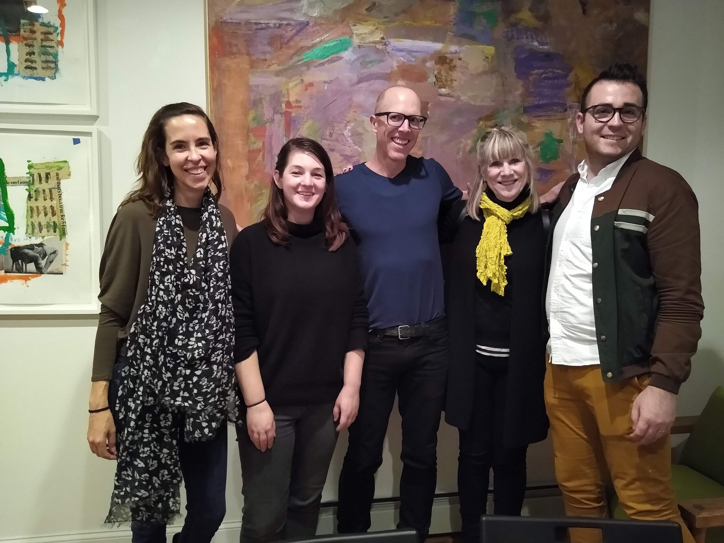
Artist Estate Studio and Artists’ Legacy Foundation partnered for an evening of discussion focused on presenting strategies for artist studio managers and their archivists. The conversation was among some of the most experienced peers in legacy planning and art management and involved key talking points about institutional representation, archive organization methods, and a walkthrough from Jason Andrew and Julia Schwartz on the most important steps to take to ensure the long term stability of an artist’s legacy. Artist Estate Studio’s design director, Peter Freeby also spoke on the top ten most important parts of digital strategy for an artist, which has been preserved below:
Photo credit: Julia Schwartz, courtesy Artists’ Legacy Foundation
1. How to design
If you design anything, you are making a physical thing, not an idea. Think through the reality of what problem you’re trying to solve, who it’s for, and why it should exist. Map out how all these relationships connect. Build the absolute simplest solution to the problem. Finally, fine tune it and ask for feedback until it does everything you want it to do and people understand the core concept in the first 5 seconds of seeing it.
2. Use existing systems
Developing a website from scratch is costly, and expensive long term, not just for the time it takes to hire a freelancer. Building digital products in the ecosystem of other digital products allows you to quickly adapt and be compatible with new trends.
3. Pay attention to pixels
Images should be Jpegs that are 1500 pixels across at their smallest dimension (1500 px wide for portrait photos and 1500 px tall for landscape photos) and should ideally be between 200 and 700 kb. Tip: don’t size up images. It just makes them blurry.
Here are 2 ways to make sure your pixels are perfect:
In Photoshop: use the "Export As" tool in the file menu and tweak the Image Size and Quality Settings to export a Jpeg that fits the dimensions you need.
In Preview: "Export..." tool and tweak the Quality slider until it fits the file size you need.
4. Make sure you’re ADA compliant
There is a current trend of lawsuits against arts organizations across the country for not being ADA compliant on their websites. Here is a quick checklist to make sure you’re safe:
all images should have captions that literally describe the image (these captions are also called Alt Text, or more broadly referred to as metadata)
make sure that any video/audio content has text alternatives with equivalent information
clearly label all text alternatives for video and audio as an alternative for said video and audio
5. Use Alt Text for Social Engine Optimization
Use alt text to describe images on your website involving artwork, events and news items. This is good for above ADA reasons, but also will assist your Google search ranking. In Squarespace you can write the Alt text for an image by writing it as the title of the image file before you drop it in your site. Describe the image, the location, and any other related keywords.
6. Data matters (but not all data)
Pay attention to the analytics on your site, but specifically watch out for Geography, Visitor Count, Time on Site, Device Usage, and Traffic Sources. These numbers can tell you where your fans are, how they’re looking at your site, and where they found you.
Photo Credit, Peter Freeby
7. Understand your fans
After combing through the data, use it to come up with a profile of what kind of person they are. At big tech companies like Airbnb these "profiles" even have a name and personality. The more you can personify the data, the more personal you’ll seem to the people who find you.
8. Design for them
If you know who likes you and how they find you and what they use, you can figure out what changes you might want to put into the site. If everyone finds you on instagram and uses an iPhone, make sure that you put the most effort into making your website mobile friendly and has interesting images that people will want to share.
Some recent data about our sites that informs us about the kind of work we put in:
Jack Tworkov visitors use desktop computers 43% of the time
Elizabeth Murray visitors use desktop computers 66% of the time
9. How to Instagram
Because of the number of profiles that have spam followers now, success on instagram isn’t as much about the followers anymore. It’s much more about the engagement with comments and likes. (followers are still important, but not the #1 priority)
According to the data, here’s how to post the best photos on instagram:
Close up shots
Portrait photos/photos with faces
Multi-photo posts
Video posts
10. Marketing
Spending a small amount on social media marketing can get you a long way, and using apps like Adobe Spark Post, it’s way easier to make a successful ad than ever.
But, email marketing is still statistically far and away the most successful way to advertise. Make sure that you are consistent, sending out an email once a month, every other week, every day, it doesn’t matter. If you can get your newsletter into someone’s routine, they will keep up with you. Also, be intentional. Emails should have very short paragraphs and images, not be long essays. They should also be sent to multiple narrow audiences, (not 10,000 people who are in a sending mailbox called "art").


